2024
CASE STUDY · CURIOSITYCON 2024
CASE STUDY · CURIOSITYCON 2024
One campaign system built to stay recognizable across 50+ communication surfaces.
One campaign system built to stay recognizable across 50+ communication surfaces.
Lead Visual Designer · Brand Strategy & Operations · Virtual event · June 12, 2024
Lead Visual Designer · Brand Strategy & Operations · Virtual event · June 12, 2024
THE BRIEF
THE BRIEF
THE BRIEF
Relaunch a dormant event—and make one visual idea survive the scale.
Relaunch a dormant event—and make one visual idea survive the scale.
Relaunch a dormant event—and make one visual idea survive the scale.
SurveyMonkey was bringing CuriosityCon back as a virtual event with a 5,000-registration target. The design challenge was not simply producing more assets; it was creating a visual language flexible enough for different channels, messages, and stakeholders without losing its identity.
SurveyMonkey was bringing CuriosityCon back as a virtual event with a 5,000-registration target. The design challenge was not simply producing more assets; it was creating a visual language flexible enough for different channels, messages, and stakeholders without losing its identity.
SurveyMonkey was bringing CuriosityCon back as a virtual event with a 5,000-registration target. The design challenge was not simply producing more assets; it was creating a visual language flexible enough for different channels, messages, and stakeholders without losing its identity.
5,000 target registrants · 50+ assets · cross-functional campaign ecosystem
5,000 target registrants · 50+ assets · cross-functional campaign ecosystem
5,000 target registrants · 50+ assets · cross-functional campaign ecosystem
Exploration: FINDING THE TERRITORY
Exploration: FINDING THE TERRITORY
Exploration: FINDING THE TERRITORY
Find a visual territory that could feel like an event without drifting away from the brand.
Find a visual territory that could feel like an event without drifting away from the brand.
Find a visual territory that could feel like an event without drifting away from the brand.
I mapped the landscape with Brand leadership—familiar to distinctive, conservative to expressive, literal to abstract—to understand where the event could credibly stretch.
I mapped the landscape with Brand leadership—familiar to distinctive, conservative to expressive, literal to abstract—to understand where the event could credibly stretch.
I mapped the landscape with Brand leadership—familiar to distinctive, conservative to expressive, literal to abstract—to understand where the event could credibly stretch.
Abstract
Abstract
Abstract
Literal
Literal
Literal
Wild / Big Zest visuals
Wild / Big Zest visuals
Wild / Big Zest visuals
Conservative visuals
Conservative visuals
Conservative visuals



Concept: THREE DIRECTIONS
Concept: THREE DIRECTIONS
Concept: THREE DIRECTIONS
Three directions gave us useful contrasts: one became the front runner, one showed how much energy the event could hold, and one clarified what felt too close to the previous brand language.
Three directions gave us useful contrasts: one became the front runner, one showed how much energy the event could hold, and one clarified what felt too close to the previous brand language.
Three directions gave us useful contrasts: one became the front runner, one showed how much energy the event could hold, and one clarified what felt too close to the previous brand language.
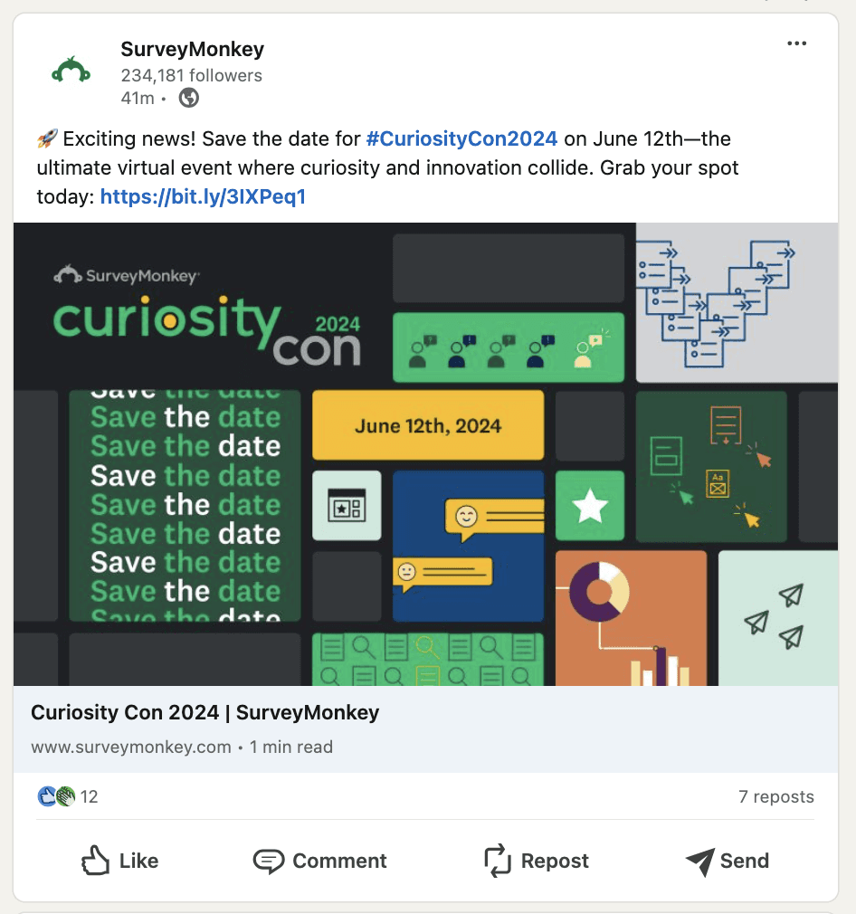
Carousel / Abstract Horizontal — the strongest direction: modular, ownable, and capable of carrying information without becoming decoration.
Carousel / Abstract Horizontal — the strongest direction: modular, ownable, and capable of carrying information without becoming decoration.

Goldie — high energy and expressive; useful evidence that the event could push further than the corporate brand.
Goldie — high energy and expressive; useful evidence that the event could push further than the corporate brand.

Road to Success — clear and accessible, but too close to familiar brand language to create a distinct event identity.
Road to Success — clear and accessible, but too close to familiar brand language to create a distinct event identity.

“
“
Contact Sales
Log In
Product
Templates
Pricing
Enterprise
Resources
con
iosity
C
ur
WHAT WE KEPT
WHAT WE KEPT
WHAT WE KEPT
Go bolder. Create structure. Clarify hierarchy. Build on the modular direction.
Go bolder. Create structure. Clarify hierarchy. Build on the modular direction.
Go bolder. Create structure. Clarify hierarchy. Build on the modular direction.
From concept direction to campaign architecture.
From concept direction to campaign architecture.
From concept direction to campaign architecture.
The final visual language had to do more than look distinctive. It needed an underlying structure that could carry different messages, formats, and moments without losing its identity.
The final visual language had to do more than look distinctive. It needed an underlying structure that could carry different messages, formats, and moments without losing its identity.
01 · BUILD THE VISUAL LOGIC
The composition was built from repeatable modules: 60 px base containers, 10 px separation, and a hierarchy that could expand, compress, or recompose while remaining recognizable.

02 · MAP THE STORY SYSTEM
The graphic followed the user journey, not a fixed template.
I mapped the journey from problem and awareness through questioning, opportunity, responses, insight, and impact. That sequence became a shared framework for deciding what the event graphic should emphasize in each communication.
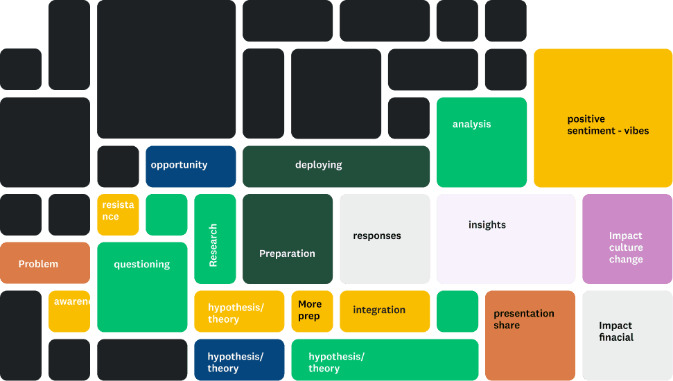
That principle is what allowed the campaign to move from one visual idea into a full communication ecosystem.
That principle is what allowed the campaign to move from one visual idea into a full communication ecosystem.
That principle is what allowed the campaign to move from one visual idea into a full communication ecosystem.
60
60
130
130
200
200
340
340
270
270
200
200
130
130
60
60
60
60
130
130
200
200
270
270
The visual language resolved into a simple modular logic: a 60px base unit with 10px separation, giving the campaign a consistent underlying structure without prescribing a single composition.
The visual language resolved into a simple modular logic: a 60px base unit with 10px separation, giving the campaign a consistent underlying structure without prescribing a single composition.
The visual language resolved into a simple modular logic: a 60px base unit with 10px separation, giving the campaign a consistent underlying structure without prescribing a single composition.
SYSTEM REVEAL
From visual expression to campaign system
From visual expression to campaign system
The design problem became: how do we make the campaign recognizable and alive across many formats without becoming repetitive or brittle?
Variation wasn’t resizing — it was preserving structure while adapting hierarchy.



JOURNEY ARCHITECTURE
The system had to hold together across a journey—not just across individual assets. Structure stayed recognizable while emphasis shifted with audience, message, and moment.
SYSTEM IN THE WORLD
SYSTEM IN THE WORLD
One language across a broad communication ecosystem.
One language across a broad communication ecosystem.
Landing pages, social, speaker promotion, email, in-product communication, and event materials all had different jobs. The system gave each execution room to adapt while preserving a shared visual grammar.
Landing pages, social, speaker promotion, email, in-product communication, and event materials all had different jobs. The system gave each execution room to adapt while preserving a shared visual grammar.
That changed the collaboration, too: reviews could focus less on repeatedly debating visual direction and more on whether each execution was doing its job.
That changed the collaboration, too: reviews could focus less on repeatedly debating visual direction and more on whether each execution was doing its job.
SYSTEM IN THE WORLD
One language across a broad communication ecosystem.
Landing pages, social, speaker promotion, email, in-product communication, and event materials all had different jobs. The system gave each execution room to adapt while preserving a shared visual grammar.
That changed the collaboration, too: reviews could focus less on repeatedly debating visual direction and more on whether each execution was doing its job.
SYSTEM IN THE WORLD
One language across a broad communication ecosystem.
Landing pages, social, speaker promotion, email, in-product communication, and event materials all had different jobs. The system gave each execution room to adapt while preserving a shared visual grammar.
That changed the collaboration, too: reviews could focus less on repeatedly debating visual direction and more on whether each execution was doing its job.
OUTCOME
OUTCOME
7,500+ registrants
7,500+ registrants
5,000
5,000
target
target
7,500+
7,500+
actual
actual
50%
50%
above target
above target
50+
50+
assets
assets
The system didn’t just create consistency. It gave us a way to move quickly without losing the idea.
The system didn’t just create consistency. It gave us a way to move quickly without losing the idea.
CuriosityCon 2024 · Lead Visual Designer, Brand Strategy & Operations
CuriosityCon 2024 · Lead Visual Designer, Brand Strategy & Operations
OUTCOME
7,500+ registrants
5,000
target
7,500+
actual
50%
above target
50+
assets
The system didn’t just create consistency. It gave us a way to move quickly without losing the idea.
CuriosityCon 2024 · Lead Visual Designer, Brand Strategy & Operations
OUTCOME
7,500+ registrants
5,000
target
7,500+
actual
50%
above target
50+
assets
The system didn’t just create consistency. It gave us a way to move quickly without losing the idea.
CuriosityCon 2024 · Lead Visual Designer, Brand Strategy & Operations
